Friday, May 26, 2023

Addressing SEOs Concerns about Google’s AI Experience

I was so excited to get access to Search Labs today to start playing around with Google’s Search Generative Experience (SGE). The SGE is Google’s response to Bing chat which was demoed at Google I/O on May 10th. Search Labs is rolling out access to people who joined the waitlist, starting today.

The I/O demo didn’t include very many responses, but its not like they could in such a short time. But that demo had a lot of search engine optimization professionals (SEOs) reeling. So far, I’ve felt pretty good about what I’m seeing in SGE from an SEO and consumer standpoint, so I want to try to put some of those initial concerns to rest.

Concern 1: This will only make zero-click searches even worse

When Google’s chatbot Bard rolled out, SEOs were concerned about the lack of citations, especially since Bing Chat included links to sources. You can read more about that in a post I did for my master’s program’s blog.So during the I/O demo when article thumbnails were shown in the AI response, many were happy.

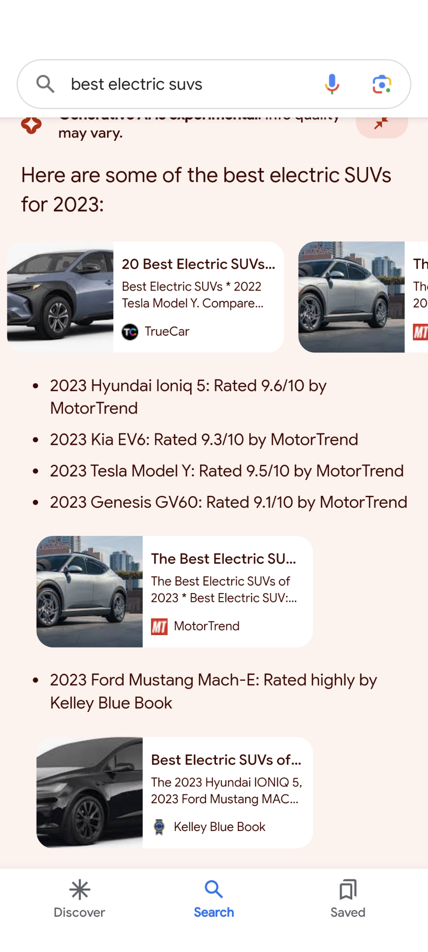
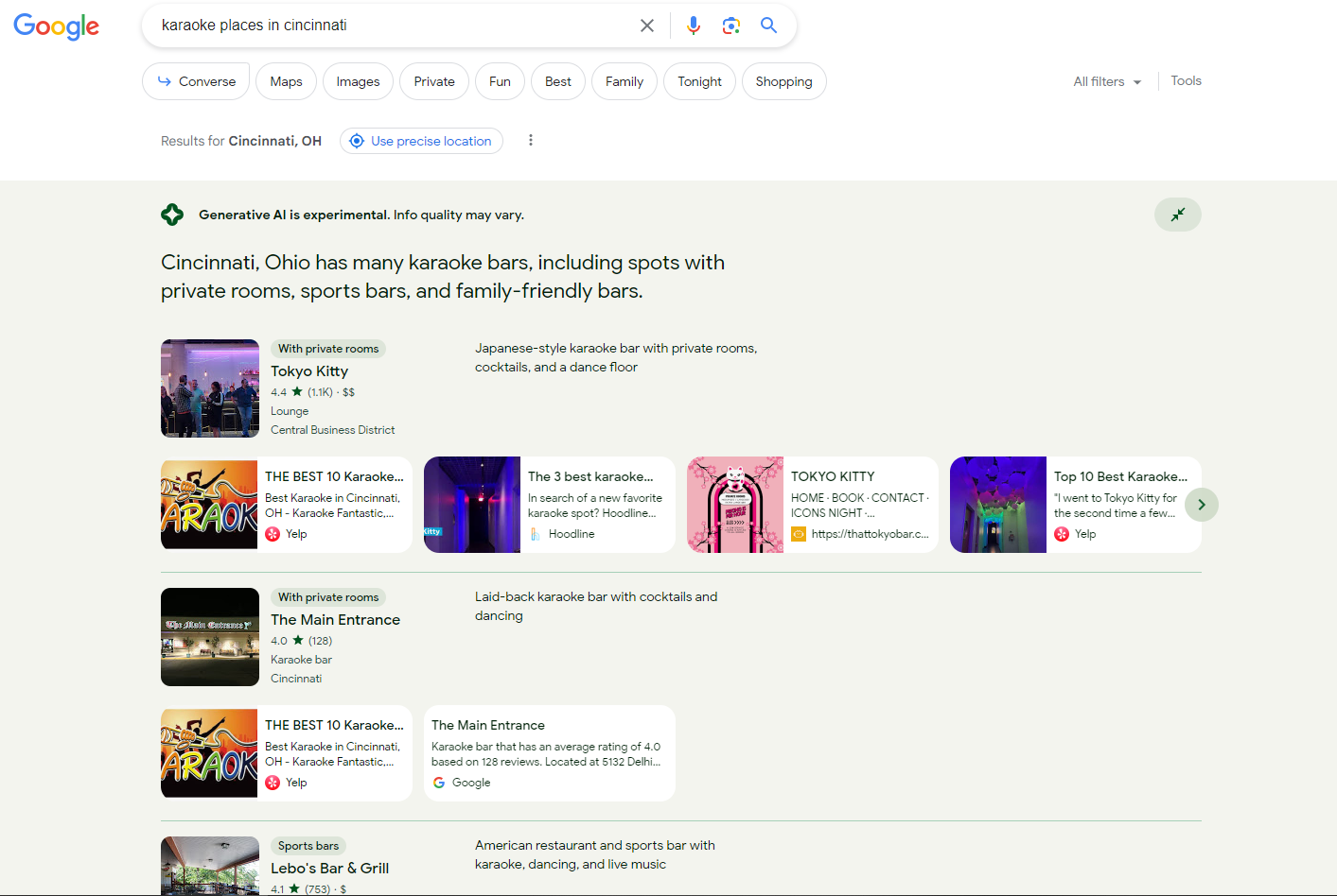
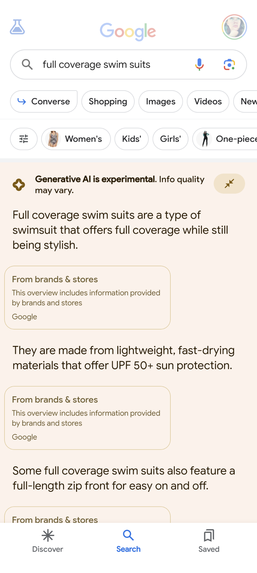
I’m here to tell you that I’m even happier with what I’m seeing in the SGE myself! In some cases, I’ve seen carousels of 8 articles shown. Will users scroll through all of those? Maybe not, but it does give more opportunities to be seen “above the fold,” especially on mobile.

Google search box on mobile has the query ‘best electric suvs’ the Generative AI response lists several vehicles and then shows a carousel of links with images below the results

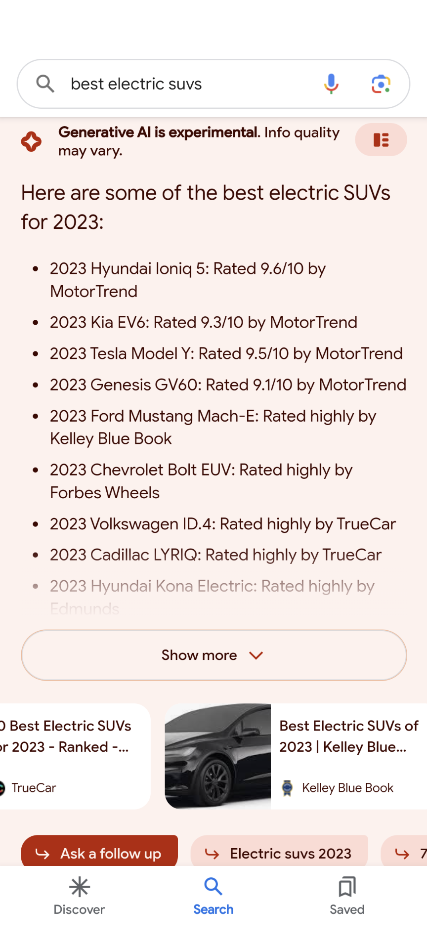
Even better the SGE offers different ways to view the response. The default view uses the carousels, but what I’m calling a “grid” view based on the image used to toggle (in the top right of the AI response) it is way better! I like it as a consumer because it gives us a better idea of what resources were used to pull what information shared in the SGE response. Plus, it pulls your potential link out of the carousel for potentially more visibility.

the ‘best electric suvs’ Google search query in mobile shows a generative AI response where after a few vehicles are mentioned links to resources are shown below and then another set of listed vehicles followed by more links to those resources

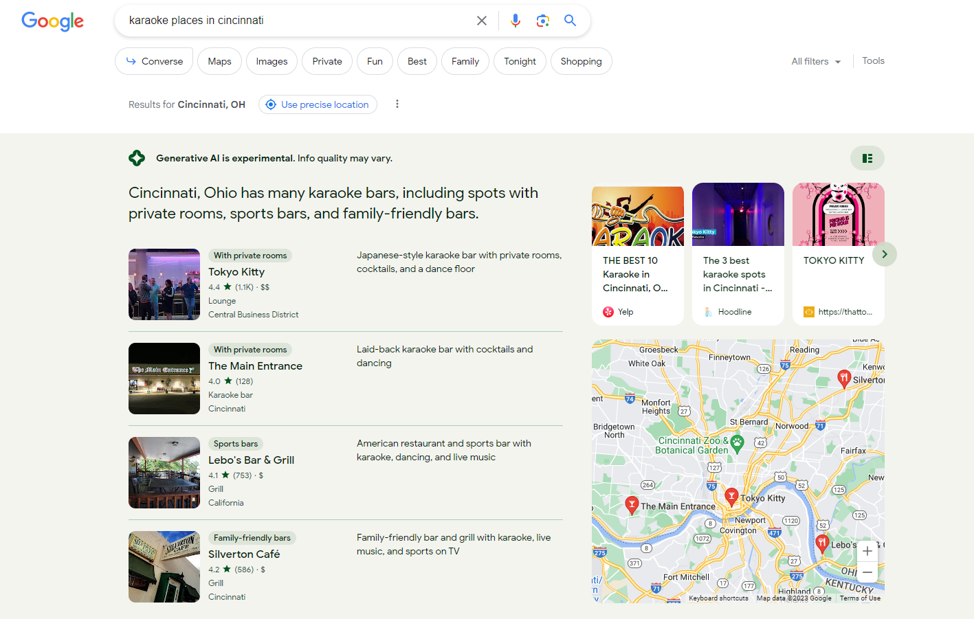
I think this “grid” view is even better with local results because it shows articles that mention the local business in whatever categorization Google has provided to it as well.

a desktop Google search for ‘karaoke places in cincinnati’ returns a generative AI response that lists one result called Tokyo Kitty categorized as ‘with private rooms’ followed by a carousel of links that likely explains more about Tokyo Kitty. The same treatment is applied to another business result with two articles referencing it

If we get Google Search Console data on this, the carousel vs. non will completely mess up impressions on the same query. Links hidden in a carousel are not counted as an impression unless they are shown, so if the carousel is dropped then an impression would hit. Could a toggle create duplicate impressions like it does in the Job/Event lists?

So how frequently does the SGE appear?

As with anything in SEO, it depends. Device type seems to come into play and of course intent/query does as well.

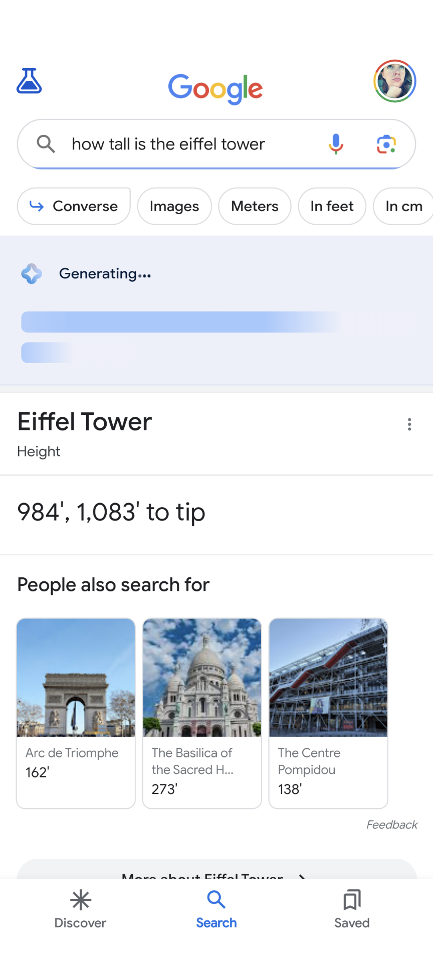
I rapid fired queries beyond what is mentioned or pictured in this post. I tested these 22 queries on both desktop and mobile. Desktop didn’t show SGE at times when mobile did.

An AI response wasn’t available on either desktop or mobile–secure a car loan. This lack doesn’t come as a surprise as Google said it would treat “Your money or your life” very carefully. However, for “is keto healthy” a response was given. On mobile there was a clear disclaimer at the top indicating this is best discussed with a doctor, but the disclaimer was missing on desktop.

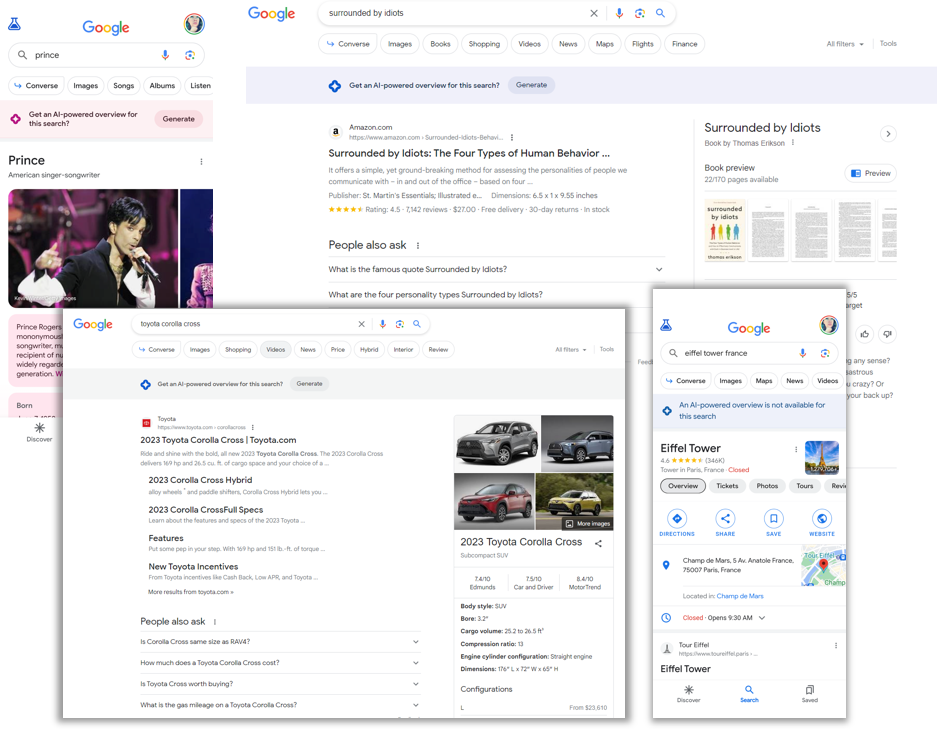
Two other queries had mixed results between mobile and desktop. “Toyota Corolla configurations” on desktop did not offer an SGE at all, but it auto-populated on mobile. “Current deals on Toyota Corolla” did not auto-generate on desktop but did on mobile. I’ll share more about a pattern for when an SGE is not auto-populated under the next concern.

Concern 2: Featured snippets or the Knowledge Panel will go away

Featured snippets exist! And when it takes a while for an AI response to show up, they are pretty prominently shown.

a desktop Google search for ‘how tall is the eiffel tower’ shows a generative AI response generating with blue bars stretching across the would-be response box but just below it is the answer already rendered in a featured snippet

It does seem like Google is not automatically triggering the AI response when a Knowledge Panel (KP) is available. See below several different KPs where the SGE is not automatically triggered. I tried many national sports teams from different sports and those results didn’t even offer an SGE option.

mobile and desktop search results for various queries show the current state of those queries with a prompt for ‘get an AI-powered overview for this search-Generate.’ The queries are for Prince, toyota corolla cross, eiffel tower france, and the book surrounded by idiots

Concern 3: Publishers are doomed on transactional terms

While, yes as shown in the I/O demo, products make up the bulk of any shopping AI responses. I’m seeing a carousel of articles–like those Interesting Finds that appeared in the past on shopping terms.

a desktop search for ‘sustainable women’s shoes’ shows a generative AI response with a blurb about some popular brands and a carousel of links next to that blurb seemingly where the response got its information

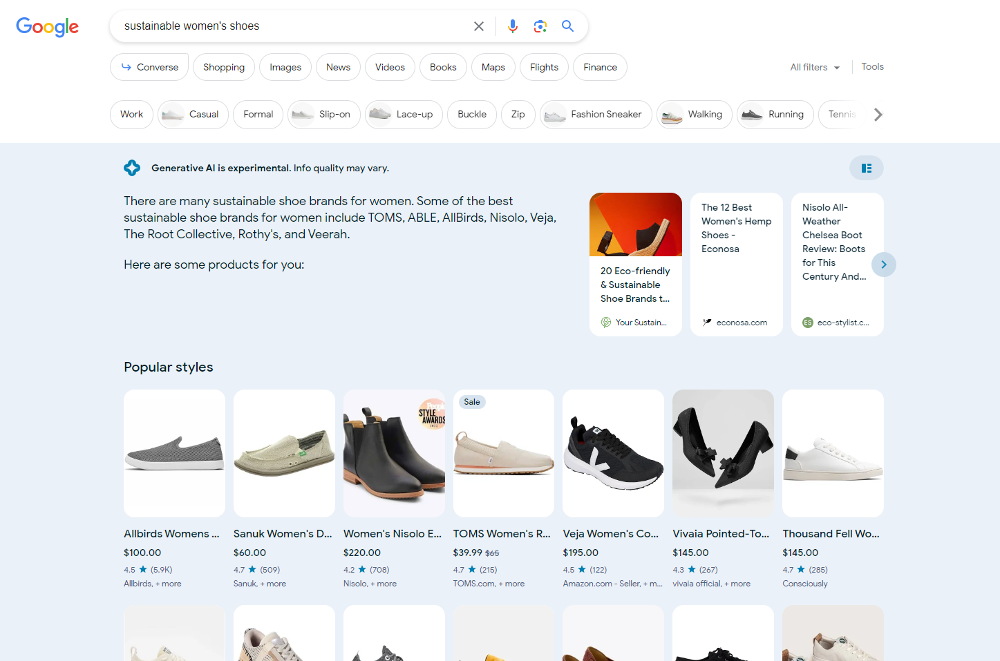
However, I’m also seeing these generate empty citations too. Possibly this means there is an opportunity for a publisher to create content that could be featured here or the experience is still lacking in generating proper sources.

a mobile search for ‘full coverage swim suits’ generates several sentences in the AI response all followed by a box indicating ‘this overview includes information provided by brands and stores’

Concern 4: Ads will take all of the clicks

During the I/O demo, it appeared that shopping ads were showing ABOVE the AI response box. Personally, I felt that would make Ads even more sought after, thus more competitive. But I’m seeing them pushed down, as pictured in the two images in the previous concern.

Other Thoughts about SGE

Local Results

On mobile, local results lack a map. I hate this. As a consumer, I like seeing the landmarks and cross streets to get a better sense for where something is in relation to other things I’m aware of. I first started testing on mobile, so I was happy to see the map does show up on desktop. However, when the grid view is toggled the map disappears (as shown above).

a desktop search for ‘karaoke places in cincinnati’ now shows just the suggested places along with a map to the right of it and a carousel of links above the map

Lists Within Responses

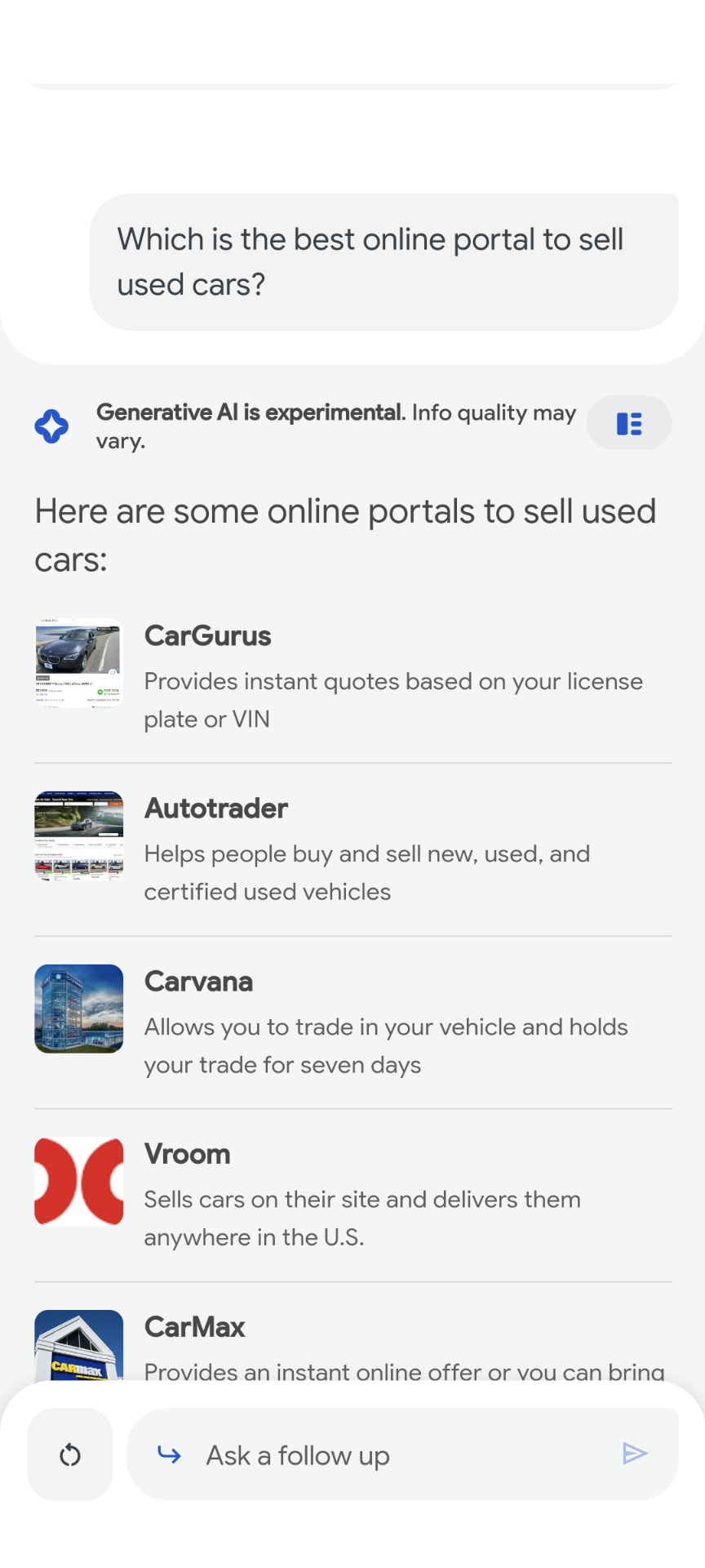
Sometimes the AI response makes these nice lists, like the ones in the local results. Those results link over to the local knowledge panel for that business. However, other lists seem like they should be clickable and are not. The following image was disappointing that these did not link over to the websites. Instead, the images opened the image search result, and many images were not even from the site mentioned.

in Converse mode of Google's search generative experience, a follow up question from 'sell my car online' was asked of 'what is the best online portal to sell used cars' which returned a list of sites with the site name, a brief description of what it offers, and an image of the site's homepage or logo next to it.

Mixed Intent

Where Google has always had mixed intent, SGE makes it even worse. General queries, like Ford, generated a local SGE for Ford dealers. Basically Google jumped a likely navigational intent to a transactional. Didn’t seem fitting.

Conversation Mode

I was quite pleased to see that conversation mode kept a similar feel to the SGE. After your initial prompt, results with links to sources were generated plus a few organic results would show underneath if you keep scrolling then with a prompt to see more search results.

Colors

Don’t be a fool and spend time pondering over the meaning behind the colors of the response box. After a long while, I realized they are based on the colors visible in the normal search results, like an image or logo.

Caveats to accessing SGE

I’m not able to get SGE to show up in search on mobile Chrome. I have to use the Google app in mobile. Also, that means you can’t use the mobile emulator on desktop to get the experience either (I tested).

As with the evolution from 10 blue links to the current rich-results heavy SERPs, Google will continuously adjust the SGE. What we are seeing now will likely not be exactly how it actually launches. But what I’ve seen has felt less “doom and gloom” than some may have expected. Plus, I see any change like this as an opportunity to keep learning and growing!

Sunday, January 8, 2023

A Prioritization Framework Specifically for Content Planning

The last time I attended a Women in Tech SEO virtual meetup I had promised a blog post on a prioritization framework I had built for content planning. But I was still finishing up grad school and never got around to posting many of the things I had hopes to on my blog.

Now that a new semester is gearing up where I’m not enrolled (I graduated in December!), I don’t really have an excuse. If you were in that WITSEO meetup and asked for this, thanks for your patience; hopefully this is worth the wait.

While SEO conferences were in full swing over the summer and fall, I saw some mentions about content planning presentations recommending the RICE prioritization method. RICE is a nice overarching scoring process developed by Intercom for product management. RICE stands for Reach, Impact, Confidence, and Effort. The Impact factor leaves a lot of subjectivity. Plus, that method lacks some nuance to content marketing. I think my scoring process takes out the subjectivity and is created specifically for content planning.

In my influencer marketing series posts back in 2019, I mentioned using a scoring process for selecting influencer campaigns. I used that prioritization matrix as the basis of this process as well. The method allows you to pick several factors and provide a value to each of 0,3,6 or 9. Higher numbers will mean a higher score and higher priority. However, you can also choose to weight factors which will multiply the score and give that factor more value than others. Thus, choosing factors and how to score them is what narrows in the method specifically for content marketing. Be sure to decide on the factors, scoring, and the weighting before you start scoring any content; otherwise, you might start allowing bias to creep in as you analyze a specific project.

Average Monthly Search Volume

Each content idea should have an associated topic that some initial keyword research should be completed around. I’m not here to tell you how to go about doing your keyword research (although I’ve got some tips from an old process I used on budget). Use your trusted tool for keyword research to determine an average monthly search volume around the topic.

Before using the scoring method, work with your team to determine the thresholds you want to use for the scores. You’ll need four ranges for the scores, typically with the last being X and above. Deciding together eliminates decisions in a bubble and some bias. Don’t worry those of you (like me) that believe in the power of zero search volume keywords, the other factors can allow for an idea to still score well, even if the search volume is low.

Content Gap

This factor may be my favorite and, along with the next, requires some competitive research. The Content Gap factor looks at how much is being written about the topic both by you and your competitors. The scoring I use is:

  • 0 if the topic is saturated on your site and your competitors
  • 3 if the topic is saturated on your site but not others
  • 6 if the topic is saturated on competitor sites but not yours
  • 9 if the topic shows a gap in the market.

Competitiveness

While your selected keyword research tool might include a competitiveness indicator. This factor looks more broadly at if there is already a lot written about the topic and if your site has the authority to compete. If a topic has already been covered by everyone, you may simply be rehashing all of that and not showing any expertise on it. I score this by:

  • 0 if the topic is overly competitive and your site has little topical authority
  • 3 the topic is competitive, but your site has high topical authority
  • 6 if there is low competition and you have low topical authority
  • 9 if there is low competition and you have high topical authority.

Content Reusability

I always hated having “content for content sake.” This phenomenon tends to happen when companies share to social media, or even worse the blog, a meaningless message tied to an upcoming holiday. Those silly, random holidays for every day of the year is how much of this is drummed up. I’ll admit I’ve fallen prey to this quantity over quality tactic in the past. This type of content is something that will have a short life, even if it is a couple of days each year.

This reusability factor makes sure you aren’t just writing content for the sake of having content. I refer to that as “fleeting” content. Fleeting could also relate to newsjacking tactics that might work for a short amount of time and then be completely irrelevant very quickly.

Another take on reusability is also how well the content can be used on different media. Does it make sense in short form video? Could it be a podcast? How can it be best used for each social media platform your company uses to target its audience? Is there a compelling way to tease out the content in your email newsletter?

Scoring for this looks at reuse across platforms/media and if the content is fleeting or evergreen:

  • 0 if the content is fleeting and not able to be reused across platforms (such as a “Happy New Years!” message on social media)
  • 3 if the content is evergreen but not easily used across platforms (i.e., product specs)
  • 6 if the content is fleeting but easily used across platforms
  • 9 if the content is evergreen and can easily be used across platforms.

Timeliness

The timeliness is pretty self-explanatory; however, fitting it into the 4 levels for scoring might not be as obvious.

  • 0 if it is not timely
  • 3 if it is an ongoing topic/trend
  • 6 if it is timely
  • 9 if it is breaking and you can be ahead of others

Again, the overall score is more important than anyone factor. Being the first to report something isn’t always the best route if it can lead to low quality work.

Alignment to Business Objectives

The factor about aligning to business objectives is a necessary factor for all prioritization matrices. If you aren’t working towards the bigger picture, then what even is the point of prioritizing the campaign/project/etc.? That doesn’t mean don’t include an idea on your scoring matrix (I use a spreadsheet with the factors as the column headings and then each idea as a row with the scoring for each column). For the Alignment to Business Objectives factor, I score a 0 if “it is not currently a priority,” yet will keep the idea alive as business priorities potentially shift. A low-level priority earns a 3, mid-level a 6, and high priority a 9.

a spreadsheet set up for a content prioritization scoring framework

There we have it! What other factors would you add and how would you score each?

Tuesday, February 22, 2022

How Brands Can Optimize Owned and Retail Channels

Ever have those ads on Facebook or Instagram that just keep coming back? Do these advertisers think they can just wear you down? Maybe they do. I had one that I’m thankful hounded me for weeks, maybe months, because I eventually needed the products offered by the brand. After a trip to the salon, I realized I needed some help repairing my hair and reducing breakage. A heatless curler ad that I’d seen what seemed like dozens of times suddenly became relevant, and not long after that I was a Kitsch customer.

Some recent Slack chats with coworkers joked about the ads following us around on social media. I admitted actually converting on the Kitsch ad, and a colleague told me that they had seen the brand at Ulta. In that moment, I regretted that I had got roped into the social ad and lost out on some Ultamate rewards points. However, I had a promo code and got 30% off my order and free shipping.

Did I end up ahead as a consumer? Did Kitsch end up ahead? Let’s look at my customer journey, how it could have gone differently with Kitsch’s omnichannel presence, and what Kitsch can do to optimize across channels.

My Customer Journey

As you know, my hair repair need aligned with a brand I’d been seeing on social media ads. Truthfully, I didn’t remember the brand name but, sure enough, was shown another ad. From the ad, I went to mykitsch.com. The website is on the Shopify platform and was using the discount code options to offer a 30% discount at the time. The discount code was displayed across the top of the site on the announcement banner. I selected the heatless curling set that I had seen in the advertisement and added to cart. The cart indicated I would be eligible for free shipping if I spent a certain amount more. This free shipping notification is another Shopify feature. Because of that option, I started to look around at other haircare items to help with my damaged hair. After finding different shampoo and conditioner sets, I went to Google Search to look up what the different types meant.

I searched for “shampoo for fine damaged hair,” which brought up several ads for products. Meanwhile the organic links were mostly for articles (Figure 1). I clicked into one article, and it was filled with affiliate links. Instead of clicking any of the affiliate links, I used the information to determine which hair bundle I should get, a shampoo and conditioner set for hair strengthening and growth.

Figure 1

Google search results for “shampoo for fine damaged hair” (Google, n.d.)


After completing my purchase, I was immediately sent a “message from the founder” email that showed gratitude for my purchase and explained how it supports a “small, self-financed, woman-owned business.” I wouldn’t receive a confirmation email for almost exactly 24 hours from the time that thank you email was sent. In between that time, I received an email promoting the discount code I had already used and some of the best sellers it could be applied to. Having not received a true order confirmation, only the thank you email, this promotional email was off-putting. I suggested via Twitter that maybe ecommerce brands should consider filtering out first-time purchasers who may not be certain of the brand yet from promotional emails until their order has shipped. This would be possible by segmenting the audience by order date, accounting for your typical order processing time.

The Omnichannel Paradox

In my journey, Kitsch had an opportunity to lose me as a customer. I could have found a similar product in the affiliate links of the articles I was using for commercial research. Had I gone back to Google to refine my search to learn more about “rice water shampoo bars” (the option I had decided on from Kitsch’s catalog), I might have been directed to the top-ranking result, Viori, or found that I could purchase Kitsch’s product from Ulta. I’m a rewards member at Ulta and the free shipping threshold was $5 less than Kitsch’s (Figure 2).

Figure 2

Google search results for “rice water shampoo bar”


As you can see in Figure 2, mykitsch.com just barely outranks its product on Ulta.com. In search engine optimization, SEOs talk about cannibalization a lot as it pertains to having links on your website, but what about a brand’s product cannibalization across marketplaces? I searched all of the Kitsch products on Ulta.com and set up a keyword list. When I applied that keyword list to ulta.com, Semrush offered “mykitsch.com” as a competitor. Although the Ulta links don’t include the brand name, most of the top ranked links for the keywords were for Kitsch products. Of those links, about half were outranking mykitsch.com for the same keyword.

Kitsch is making money whether they sell the product on Ulta, Amazon, or their website, right? But these customers might not be created equally. A customer purchasing off a marketplace will likely have no communication solely branded and may not even associate with the brand at all. Kitsch wouldn’t have had an opportunity to explain its values in a message from the CEO following my purchase off another site and probably not many opportunities to continue reaching me with promotional emails.

So, should brands avoid selling on marketplaces? Not exactly. Marketplaces give brands an opportunity to reach people that may not have heard about the brand otherwise. Think back to my colleague that recognized Kitsch from Ulta shopping. By offering its products on Amazon, Kitsch is able to reach the 51% of customers that start their shopping there. Semrush shows more than 60% of traffic to mykitsch.com is from direct traffic and nearly 70% of organic traffic is branded, so the brand appears to be pulling back in customers from these other channels.

How to Optimize Across Sites

To help bring traffic to the brand site, offer exclusives that are not offered on retailers, as recommended by Digiday. Kitsch does this by offering bundles that are not available on Ulta. However, Kitsch could stand to offer a discount for the bundle to help entice customers to buy it on the site versus buying the items separately (if bundled products are available individually elsewhere).

To fight cannibalization across sites, tailor your product descriptions and images for each site. Google offers a competitive analysis of retailers that can give companies insights into where audiences converge. Using that and data from Semrush’s Market Explorer can help brands understand the demographics and interests of the audience for each site. And don’t forget about the site search for each of those sites. Consider how these different audiences might search for the product within the site to use that to differentiate your product pages.

Monday, February 14, 2022

Semrush Tools I Wish I’d Known About as an SEO Team of One

I’ll admit that with more of a focus on data and technical SEO in my current role, I don’t do much keyword research anymore. In past in-house roles, I used Moz. When I had access to both Moz and Semrush, I leaned more heavily on Moz because I was more familiar with it. So, although I’ve had access to Semrush for at least 4 years now, I don’t have much experience with it outside of the Keyword Magic Tool and Position Tracking. Playing around in Semrush beyond my daily work for my Web Metrics and SEO grad school class has forced me to explore into unfamiliar territory. Had I known about these other tools and features (some of them didn’t exist at the time, though) when I was an in-house team of one, I would have definitely gone with Semrush over Moz.

Link Building Tools

Although I’ve been in digital marketing for more than a decade, I’ve done very little link building. I only really focused on broken link reclamation. As an in-house team of one managing all content marketing, I often checked for broken links in Google Analytics (that didn’t require me to pay for a tool) from referral traffic. With access to Moz at the time, I did get a little bit of information from its Link Explorer tool, which I would use to add to a disavow list. (Before you disavow though, I’d recommend reading this article!) With the Indexed Pages report within Semrush’s Backlink Analytics, I could have more easily seen where backlinks were 404ing (Figure 1). By connecting with Google Search Console (GSC), the Backlink Audit allows you to manage a disavow list and import in your existing one to automatically parse out duplicates.

Figure 1

Screenshot showing how to filter the Indexed Pages report to broken links only (Semrush, n.d.)


As for link building campaigns, I’ve never really done those. When I was in-house, I’d get brand mentions or links by building relationships and partnering with other big players in the industry. These mentions and links were found with social listening tools, which gave me more information than most SEO link tools. (The Brand Monitoring tool inside Semrush looks promising, though). However, I had to keep the backlinks in a spreadsheet since social listening tools didn’t show if/when you’d lost the link. If I had been looking to do link building campaigns, the Link Building Tool would have been extremely helpful. It shows opportunities for keywords you’d like to target on sites that complement you or your competitors. From my experience, a way for Semrush to improve that tool is to highlight where a broken link already exists on a recommendation and encourage the broken link outreach type. Also, it would be great to allow users to add/update contact info in the monitoring section, so you have it in one place who you specifically worked with to earn or update the link. A built-in contact update would have saved me from managing separate spreadsheets of contacts and brand mentions/links.

Listings Management

For only an additional $40 a month, you can have listings managed for 70+ directories, respond to reviews across sites in one portal, and get local map pack heat maps. When I was working with a regional hospital system, I remember using ReviewTrackers for managing responses across review sites. A portal to see reviews across sites and respond from one interface makes it so easy for a customer service team that will likely be managing the responses. Unfortunately, ReviewTrackers doesn’t list the pricing, which probably means it is going to cost way more than $40 a month. Additionally, that tool didn’t also give me listings management and the local heat map. The listings management is handled through Yext, which some people don’t care for. The local heat map allows you to see how well your business performs for up to 5 different keywords around your region. I’ve been seeing these types of graphs shared by local SEO folks on Twitter (I’m not sure if these were from Semrush’s tool, though) and thought it was a very cool visualization.

Even if you don’t want to pay the money the listings information is available in Semrush to show you where you have missing, incorrect, or incomplete information (Figure 2). That information alone will help make manually updating your listings a bit more manageable.

Figure 2

A screenshot showing missing, present, and not present data from a free Semrush listing analysis (Semrush, n.d.)


EyeOn

Poking around in the Trends portion of Semrush, I spotted a tool that is still in beta, EyeOn. Semrush says it “automatically tracks your rivals’ moves: from new content to promo shifts.” This one caught my attention because I just recently set up a script to allow team members to drop in RSS feed links and get a formatted spreadsheet to monitor industry news and competitors. EyeOn not only shows recent updates about your competitors’ websites but also monitors their search advertising. I regularly meet with our search marketing team to share insights and plan forecasts and will definitely start sharing this report with them! One thing that Semrush could do to improve this report is to add in data from the Facebook/Meta Ads Library.

Log file Analysis

As the lone SEO, I remember being excited to get log files from my IT department. However, I could only get 7 days’ worth of data in one file. Additionally, I didn’t have the best way of filtering the data other than using Excel filters. Semrush’s Log File Analysis tool would have allowed me to filter down the logs to those just from known Googlebots and sort by desktop and mobile. Additionally, it seems as though you can import multiple logs (as long as, it is for the same website), which would have made it easier for me to add and combine my 7-day exports.

As I mentioned, having the opportunity to explore the tool beyond what I need done in the moment for work has opened up a whole world of possibilities. This post barely scratches the surface of all the tools available, and I plan to play around even more to discover them all! Thanks to the Semrush team for giving students free access!

Monday, February 7, 2022

Anti-Social Brands' Lessons in Social Media Strategy

Trying to build your social media strategy? Looking at all the available platforms and how you should approach them from marketing, sales, and a customer service perspective can be overwhelming. If you have the resources to monitor and respond on all platforms at scale then more power to you. However, that’s unlikely for most businesses. As Vatuone says, “an empty profile is worse than no profile at all.” RH, formerly Restoration Hardware, is a great example of Vatuone’s theory in action.

A lesson in not investing in social media

RH’s CEO Gary Friedman doesn’t believe in investing in digital, and as such the company has no official or active social media profiles. What looks to have been an old Twitter account stopped sending tweets in 2011.The Facebook profile that was linked to and posting automatically to Twitter (not a recommended practice) in the past no longer exists. No Instagram. No Pinterest. However, there is a YouTube channel with a few videos posted each year for the past seven years, although nothing in the past year. Friedman believes that the web is “the most democratic channel” by allowing the smallest retailers to look as big as the largest. “You would have to click 10,000 times to know how large our assortment is,” he says. Freidman reduces social media down to “posting online about ourselves.” So, does this strategy work?

In 2014, the latest RH source book shipped out, weighing in at 17 pounds and with 3,300 pages. From the Business Home profile, Friedman claims source books are “the only physical manifestation of our brand” in some markets. The brand faced a lot of backlash on social media as those receiving the catalog felt it was wasteful. Rather, the brand ignored backlash on social media because it did nothing to respond to concerns since it isn’t active on any channels. The company didn’t even provide a statement to the press, instead pointing the media back to the latest earnings call where Friedman rehashed the stance on needing the catalogs to truly show the company’s assortment (Finney, 2014).

Friedman’s take on social media falls short in that social media isn’t just posting about yourself. That strategy doesn’t consider the need for addressing consumer’s issues where the customer is. His strategy is “doing great work and letting the world talk about us.” Is it truly a great customer service if your team isn’t picking up on sentiment or issues from people’s concerns across the web and adjusting? Instead, RH is forcing the user to come the company’s service funnels on the company’s time.

What about building a community? Brand advocates want to see their renovations shared by the brands they love (believe me I worked in the industry and grew the Instagram following that was already in the thousands more than 400% in a year by tapping into the community). RH is missing out on creating relationships with brand ambassadors, like one home renovator whose renovation Reels had 100s of thousands of views. She was “almost heartbroken that they don't want to see what she’s done.” RH fails to understand the conversation over content aspect of social media since it has a leader that is too concerned about showing off its assortment to talk about it with excited customers.

Rather than completely abandoning social media, consider Lush Cosmetic’s approach. In November 2021, Lush went dark on Facebook, Instagram, Snapchat, and Tik Tok with a clever post to its channels (Figure 1). The brand put out a statement explaining that these channels are bad for your mental health which is antithetical to self-care and relaxation that their products embody. However, the brand is still using Twitter, where it is actively responding to customer comments and complaints. Lush proves you don’t have to be every where to make it work for your brand and your customers. But how do you decide where to focus those efforts?

Figure 1

Lush Cosmetic’s Instagram Profile encouraging users to “be somewhere else” (Lush Cosmetics, [@lushcosmetics], n.d.)


How to pick your social media platforms

Lead with your values

First and foremost, stand by your company values. Lush realized certain platforms didn’t support its values and are avoiding those. Maybe some of the shadier side to Reddit means you’d rather not dive into that platform.

Find where your audience is

In addition to thinking about your values, consider those of your target audience. On what social media platforms might you find your consumers? Research the different social channel demographics and see which align to your best customers or most promising new customers. Check your website analytics and see where your most active website users are being referred. Even non-social referral channels can give you an idea of the type of websites and its demographics that could align with a certain social channel.

Consider the type of content to be shared

Depending on the type of content your business is more adept at creating can also lead your business to focus on a certain platform. HubSpot focuses on 5 types of social media:

  • social networking, including Facebook, Twitter, and LinkedIn
  • photo sharing, including Instagram and Pinterest
  • video sharing, including YouTube and Vimeo
  • interactive media, including Snapchat and TikTok
  • and blogging, including Reddit and Tumblr.

A SaaS company using mostly stock photography for its website is not best suited for a photo sharing platform. However, video tutorials of the SaaS product could do well on a video sharing platform or even on interactive media. Who would have thought Excel could be such a cool thing on TikTok?

RH is perfectly suited for Instagram. #restorationhardware has 350k+ images tagged. However, the hashtag is losing the plot to those doing their own restoration of vintage items. Meanwhile, by at least having an Instagram profile, Lush is still able to have the conversation directed at them by consumers advocating for them on that platform.

No matter which platforms you decide on remember that they all should be used to engage with your customers. I’ve been harping on the need to see social media as a customer service tool for a decade now! If your brand hasn’t established a strategy around social customer service yet, Business News Daily offers several best practices for approaching social media as a relationship building opportunity through customer service.

Tuesday, February 1, 2022

A Marketer's Guide to Google Tag Manager

When thinking about web analytics it would be remiss to not mention a tag management solution. Tag managers have been around for about 15 years. Google launched Google Tag Manager (GTM) in 2012. GTM integrates nicely with Google Analytics and other Google tools.

What is Google Tag Manager?

All tag managers create a container that allows website owners or marketers, even non-technical ones, to place and manage all their third-party scripts, or code snippets. As Google explains, these snippets of code are called tags. Tags are fired when a certain event happens. These events are called triggers. Common third-party scripts used in tag management tools are web analytics, A/B testing tools, and advertising partners. Google Tag Manager also introduces the dataLayer which allows for custom events and variables.

What’s the dataLayer?

Think about the data available on an analytics request when a user views a product page. The data could include a unique user ID (if the user is signed in), information about how the user was acquired within that visit, and, of course, product details. As a marketer, you want to share this product view data with your customer relationship management (CRM) tool, your website tracking, and advertising tools. Instead of having to push the different data from this event that each tool uses, you can push that information to the dataLayer one time. Then all those tools can access what data it needs from the dataLayer with separate tags.

Pros of GTM

Reuse variables and triggers

As mentioned before, multiple third-party tools can get the same information from the data made available in the dataLayer. However, Google Tag Manager also allows you to create triggers, or events, which are used to fire the different tags. These triggers can be used to fire multiple tags. So the product view event can be used as a trigger in a “ViewContent” Facebook Pixel Tag and an e-commerce Google Analytics tag. Having established triggers and variables also makes it easier to migrate tools, like switching over to GA4, or integrating new tools, such as adding a privacy control tool.

Integrate cookie control

With CCPA and GDPR, cookie control management is a necessary part of website tag management. Tracking and advertising scripts should not be fired until a user opts into them. When using a tag manager, the cookie acceptance (or rejection) can be passed as a GTM variable. The trigger for the tags can require that the cookie type was accepted, which could be indicated by a “TRUE” value in the dataLayer. Cookiebot and Google Tag Manager have teamed up for a more seamless integration for cookie preferences.

Update without a developer

Although one of the most heavily marketed pros to tag managers is the ability to add advertising tags to the website without the need for a developer, this pro comes with a large caveat. A snippet of code must be added to every page of the site that will need to use the tag manager, which is likely every page on the website. Additionally, if your tag management strategy hopes to use custom variables and events, information needs to be pushed to the dataLayer from the website. Alexander (2013) explains how this can be done a few ways, either on the back end or the front end.

If the developers haven’t already created a dataLayer push call on the page’s source code, then data will need to be pulled from the rendered page, or front end code. If the data needs to be pulled from the front end, then someone on the marketing team needs to be comfortable with HTML to find and declare appropriate DOM elements. For example, if a typical onSubmit JavaScript event doesn’t fire on a form, you might need to use a click event that targets the form button. You can use the Chrome Developer Tools to inspect an element and determine the CSS selector for it. If you aren’t sure about CSS selectors, a Chrome extension, like Copy CSS Selector, can help with that.

Testing

In 2020, Google Tag Manager released a new Tag Assistant tool that makes previewing and testing your tags so easy. Once you’ve updated your container, simply click the Preview button. This opens a new tab that prompts you to type the domain on which you will be testing. (If you don’t have the GTM snippet on your site, you can use a Chrome Extension to add it in). Once connected, the Tag Assistant tab updates to reveal all the events firing on your website, which loads in a popup window. As you click around on your site, the events appear in the left-hand menu. When an event is selected, you can click in to preview what tags are fired from it (if any), the dataLayer, and variables. Figure 1 shows what a preview of the variables available on a built-in link click event. Learn more about testing with this guide from Ahava (2020).

Figure 1

GTM variables from a link clink in preview mode


Cons of GTM

Extra code

Because we are using another third-party resource to load all the other ones, we have more code to worry about. GTM must load its JavaScript file, which then calls each of the JavaScript files used for the tags within GTM.

For my website analytics, I use GTM. My GTM container has 4 tags, 3 triggers, 11 variables (2 of which are user-defined). The JavaScript file is ~38kb. Meanwhile, I’ve helped clients implement extensive custom event tracking in GTM sending to multiple tags. Those implementations can cause the initial GTM script file to be 5x the size of my basic GTM setup’s file. Google offers some advice on how to keep your container from getting too large.

If you were thinking of using GTM just to “add scripts without a developer,” I hope you will consider these more advanced options and approach it with a more strategic view. What data might you be sending to different scripts separately that you can consolidate into the tool? How might you capture that information and share it back to GTM? Happy tagging!

Monday, January 24, 2022

The Channel Manager’s Best Google Analytics Report

If you manage an acquisition channel—like organic search, paid social, email, etc.—then the Landing Pages Report in Google Analytics should be your best friend if it isn’t already.

What is a landing page

You might call any priority page where you are sending a campaign a “landing page.” However, in Google Analytics, a Landing Page is specifically the dimension that indicates which page a user entered the site. Other tools, like Adobe Analytics, call this an “entry page.” This dimension tells us on what page the user started their session. Thus, this dimension is scoped at a session level, which I’ll explain more about.

What are entrances then?

If you are playing around in Google Analytics, you might also come across the option for “Entrances,” which is a metric that counts the number of times a page served as the first page of the session. Learn more about dimensions and metrics in this guide from Google.

Scope

So, what is a session-level scope? Stecklein from Seer Interactive details the scopes used in Universal Analytics. Those four different scopes for reports are:

  • user
  • session
  • hit
  • product.

Although most of the information within the “Behavior” section of Universal Analytics is hit-based, such as pageviews and events, the Landing Pages report, which is under Site Content, is a session-level scope. This can be confusing because dimensions and metrics can only be paired if they have the correct scope. Google offers a reference guide for these pairings. A good way to determine the scope of your report is to see what metrics are available on it by default.

A pageview is a specific hit that sends one request to the server. Page-level reports show metrics like pageviews and time on page. Meanwhile, sessions look at all hits from the beginning of a session starting to its end, when the user exits the site or the session times out. Thus, session-level metrics include sessions, pages per session, and average session duration. Refer to Figure 1 to see the different metrics used in the Landing Page report vs. the All Pages Report. You’ll see in the image the Entrances dimension on the All Pages report, which indicates how many times a session began on that page.

Figure 1

Universal Analytics Landing Page Report vs. All Pages Report (Google Analytics, n.d.)


What about Landing Pages in GA4?

I hope I’ve made it clear that these scopes and the Landing Page report are tied to Universal Analytics. The largest difference with GA4 vs. Universal Analytics is that GA4’s data model doesn’t focus on sessions as Universal does. As such, “landing page” doesn’t exist in GA4. Learn more about the differences with session-level data in GA4 from Bounteous.

So how can you review landing pages? GA4 has a built-in event/hit of “session_start.” When paired with a page dimension, “session_start” shows which pages users are entering the site. Instead of looking at this as a “page,” you must consider “session_start” as an event. Thus, you can find entrance pages by going to Reports > Lifecycle > Engagement > Events within the GA4 menu. The main Events report shows all the available events. Once you click into the “session_start” event specifically then you can scroll to review the top pages for this event (Figure 2).

Figure 2

“session_start” event report in GA4 (Google Analytics, n.d.)

If you’d like to look more at the page level, then you can use the event metrics to create an “entrances” metric. The reports in GA4 are very lackluster compared to the options available in Universal Analytics, so creating custom dashboards seems to be the better route. Omi Sido explains how to add the session_start event to GA4 page reports and how to create a custom report in the Analysis Hub.

Tips and Tricks

The Landing Page Report can get a little overwhelming if you have a lot of content. If your site doesn’t use Content Grouping (refer to the red line in Figure 3), then you can use Advanced Filtering to filter down to a specific page or group of pages. Basic and Advanced Filtering is pictured in a blue box in Figure 3. Be careful filtering to exact page matches though because query string parameters and inconsistent trailing slashes on pages can cause an extra row for the same page, as seen in Figure 3.

Figure 3

Filtering options within the Landing Page report (Google Analytics, n.d.)

If you are looking to narrow down the report by your acquisition channel, then you can use segments or advanced filtering for that too. Segments are useful when you have a channel or source/medium on which you regularly report. Meanwhile, if you are digging into a more specific referring domain or source/medium, you can also filter by adding a Secondary Dimension, which is highlighted in yellow in Figure 3. Use the Advanced Filter options to select the Secondary Dimension for your filter or the filter will stick to the Primary Dimension as the default.